
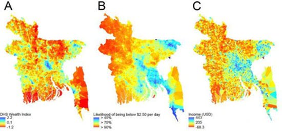
Which country the map in the photo below corresponds to is difficult for anyone to guess. It is Bangladesh. So, one would assume it is some kind of meteorological map. Or a fire map.
No. It’s a “poverty map”. Created (in collaboration between the University of Southampton and the mobile phone company Grameenphone) with data and information collected from mobile phone usage — in Bangladesh.
If one takes these particular researchers seriously, mapping poverty through mobile-phone data (and metadata) is a very big deal! Why? Because (they say) this information is “dynamic”, it changes, so… one can track the evolution or movements of the poor in “real time”…
What else will the “experts” come up with to earn their daily bread? What else?